🧑🎨 Design System
ROLE
UI/UX Designer
DURATION
Feb 2022 - Aug 2022
TEAM
3 Designers
Overview
Brand • Guideline • Foundation
A design system is a collection of reusable components, guided by clear standards, that can be assembled together to build any number of applications, and the need for them go hand in hand with the need for scale, efficiency, and consistency in Design. They basically bring order to chaos. I created and organized the first company-wide UI/UX design system for DataChat. In this project you will see some of the components I built for this design system but a design system is much more then just a component library. Take a look at what I put together below.
Foundation
Foundations are the visual elements needed to create engaging end-to-end user experiences. This includes guidance on typography, iconography, color palette, layout and structure.
✒️ Typography
As a platform for data science, I wanted to go with a clean and versatile font. I chose Source Sans Pro because it is easy to differentiate similar letter shapes (such as uppercase I and lowercase L).
It is designed with a more generous width than many other comparable Gothic.
Its shorter majuscule letters, combined with minuscule letters with longer extenders, create a more pleasant reading texture in longer text passages.
Typography hierarchy
👁️🗨️ Iconography
Icons are a set of visual representations of actions, objects, or concepts that are used to communicate information quickly and efficiently to users. Icons can be used to improve the usability and accessibility of an interface, by providing a visual shorthand for common tasks and functions. DataChat doesn’t require too many icons, so I went with the Material UI Icon library because it's simple, informative, and complements the overall visual language of the design system. I went with a simple icon set because detailed icons increase cognitive load. I focused on simplicity to help users understand the concept the icon represents and recognize icons on smaller screens.
Icon collections
🌈 Color palette
Although I value an aesthetically pleasing use of color, I place a higher value on clear communication. Color supports the purpose of the content, communicating things like hierarchy of information, interactive states, and the difference between distinct elements. To me colors should have meaning and be selected intentionally. Not based on what you like or what you think looks good. In DataChat every color has an assigned role, which hold a specific meaning based on how they function within the interface. By defining the color roles it makes things easy to modify and customize later. They also extend the color system so it works across multiple touchpoint.
Color palette
Components
A set of user interface (UI) elements like buttons, lists, icons, and code snippets…
❖ Button
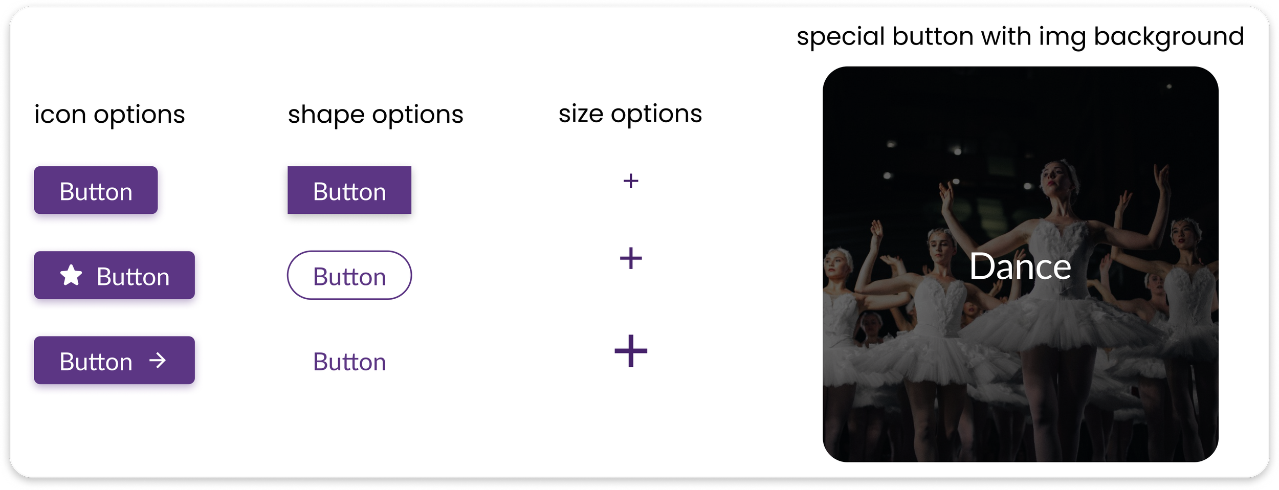
Simple buttons include different options for icon, text, outlined, radius, shadow...
Example of buttons
❖ Input
Textfield to allow user inputs, such as simple, number and search input.
Example of inputs
❖ Other Components
Design systems are complex. To round this out I just wanted to show a few of the other components that I've done so far to help standardize the design workflow and improve design efficiency, such as accordion, loader animation, message bubble, tabs, etc…
Example of other components
Impact
🏆 Created and organized the first company-wide UI/ UX design system.
🏆 Standardized the design workflow and improved design efficiency by 50% .
“👏 It’s so helpful to have guidelines to follow, and the design system saves me a lot of time when making styling decisions. ”
⚠️ Design Systems are like a living organism in that they complex and ever evolving.What I showed here is just a section of what goes into a complete system. A complete system contains the following 👇
documentation
A shared space where you say when and how to use the design system.
visual language
Guide to what the brand feels like.
pattern library
Also called "component library" includes what you see above.
brand guidelines
Includes principles, tone and voice, writing style, and more.
css framework
Front-end code that developers use to build a product.
🔄 DataChat Design System is still a work in progress but that's how it's supposed to be.


