👩💻No-code Data Analysis
ROLE
Design Lead
DURATION
Dec 2021 - Jan 2023
TEAM
2 Designers • 6 Engineers
Overview
DataChat is a no-code data science platform that:
Empowers non-developers with advanced data science technologies.
Makes any analysis reproducible for the user.
Enables collaboration across teams.
Problem
People who have data may lack data analysis knowledge, and they often struggle to view and interact with data efficiently and easily. Additionally, it can be costly to find a data scientist for every inquiry.
Old design is not users-centered:
❌ Accessibility problem, color contrast, inconsistent icon, etc…
❌ Data table is raw, not using space wisely, lack of control on different levels
❌ Bad user flow on loading, viewing and analyzing data
Design Process
Target audience
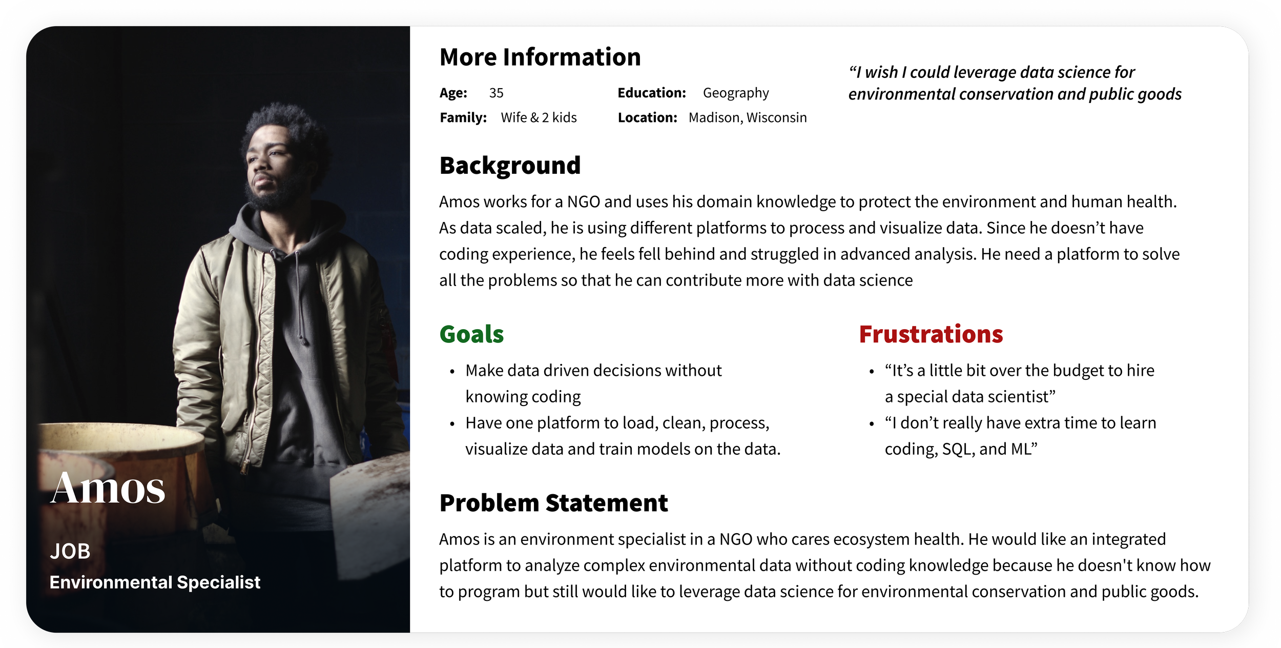
Our customer success team interviews and created empathy maps to understand the needs from users. A primary user group identified through research was people (age 20 - 45 yrs) would like to analyze data but no background in programming. This user group confirmed initial assumptions about DataChat customers, but research also revealed that other problems included dataset granularities, dataset sources, or learning curve that make it difficult to analyze big data.
Analyze Data
without programing background
20+
DataChat customers interviewed
20 - 45 year-old
User group
Design strategy
I had some assumption how to help the target users, and run a workshop with my team. Here is the design strategy based on How might we (HMW) infinity map:
Streamline data import?
Connect to data with customized recommendations
Simplify data preprocessing?
Offer adaptable data visualization choices using tables and charts
Optimize data analysis?
Engage with the AI agent without coding
User research
Based on the initial feedback from the findings, our team identified some key pain points and potential opportunities by creating personas and user journey map, started with wireframes and prototypes, and refined the design by usability tests in an iterative approach.
Personas
User journey
📍 Mapping a common user journey by listing all actions, tasks and corresponding emotions of users to load, view, clean, and visualize data can help reveal the improvement opportunities for DataChat Grid mode.
Wireframes
We brainstormed and drafted multiple ideas on paper first, and then selected several key features to develop further in digital wireframes to map out a general user flow.
Paper wireframes
Stars were used to mark the elements of each sketch that would be used in the initial digital wireframes.
Digital wireframes and workflow mapping
Prototypes
Workflow 1
Data import from different resources with frequently used recommendation
Workflow 2
Uncover data trends through interactive conversations with Generative AI support
Usability study
Our customer success team carried out several rounds of usability studies, and I concluded some important findings:
Users would like a quick way to view dataset with more space
Users would like a quick way to see the statistics of the dataset
Users would like to load dataset from different sources
Users would like more ways to process dataset on different level (column, cell, etc…)
Major Design Iterations
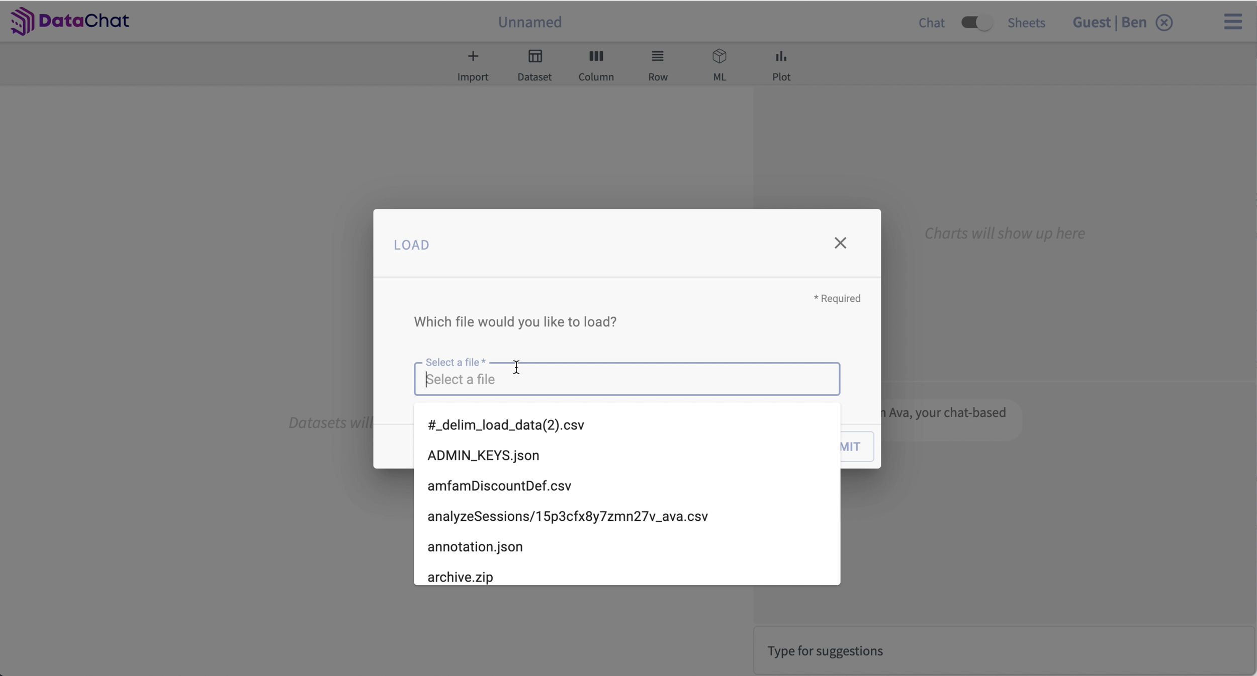
Iteration 1: Clear and smart guidance on data loading
The new file loading UI provided more accessible and fluent data loading user flow:
Supported multiple data sources: files, snapshots, databases, and external URLs
Displayed loading recommendation history based on user’s behavior
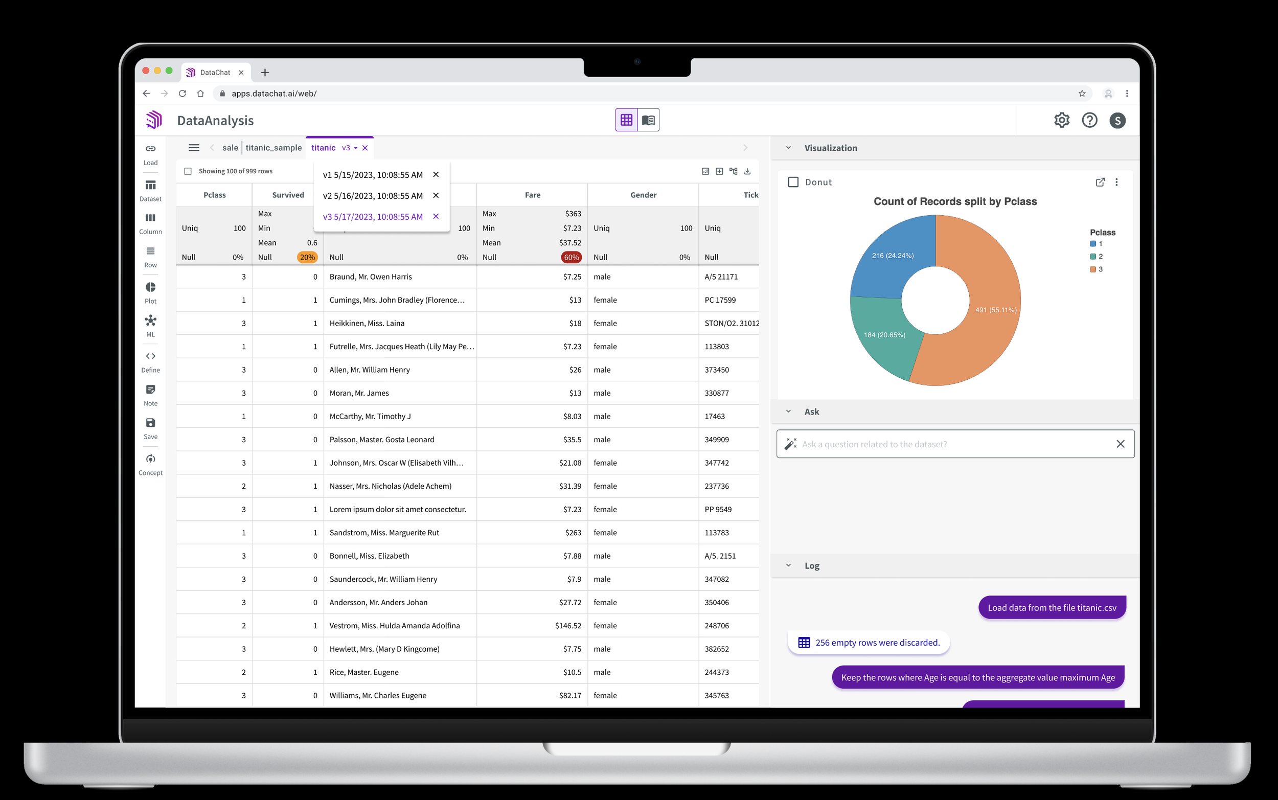
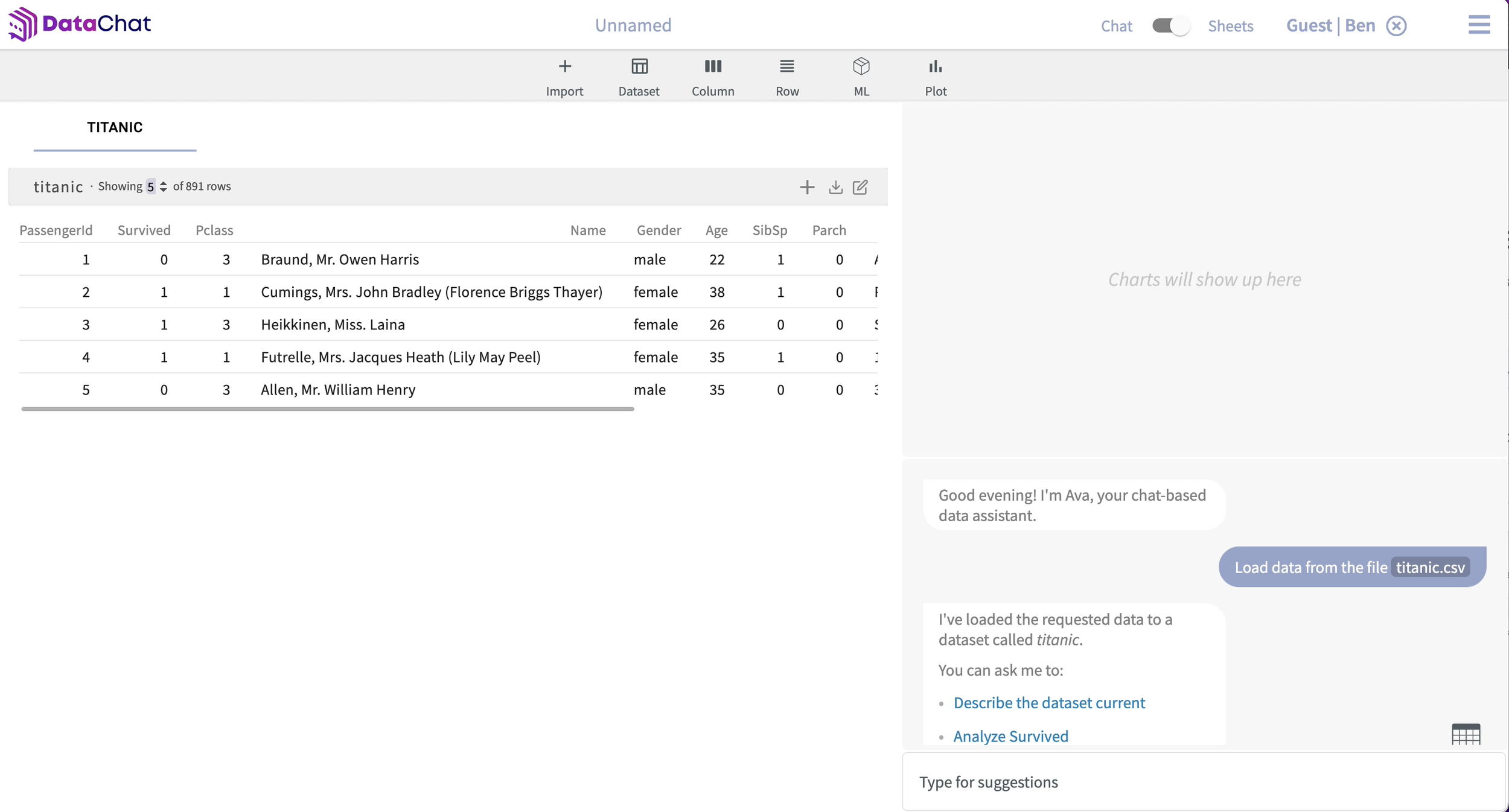
Iteration 2: Optimize data display and improve ease of use
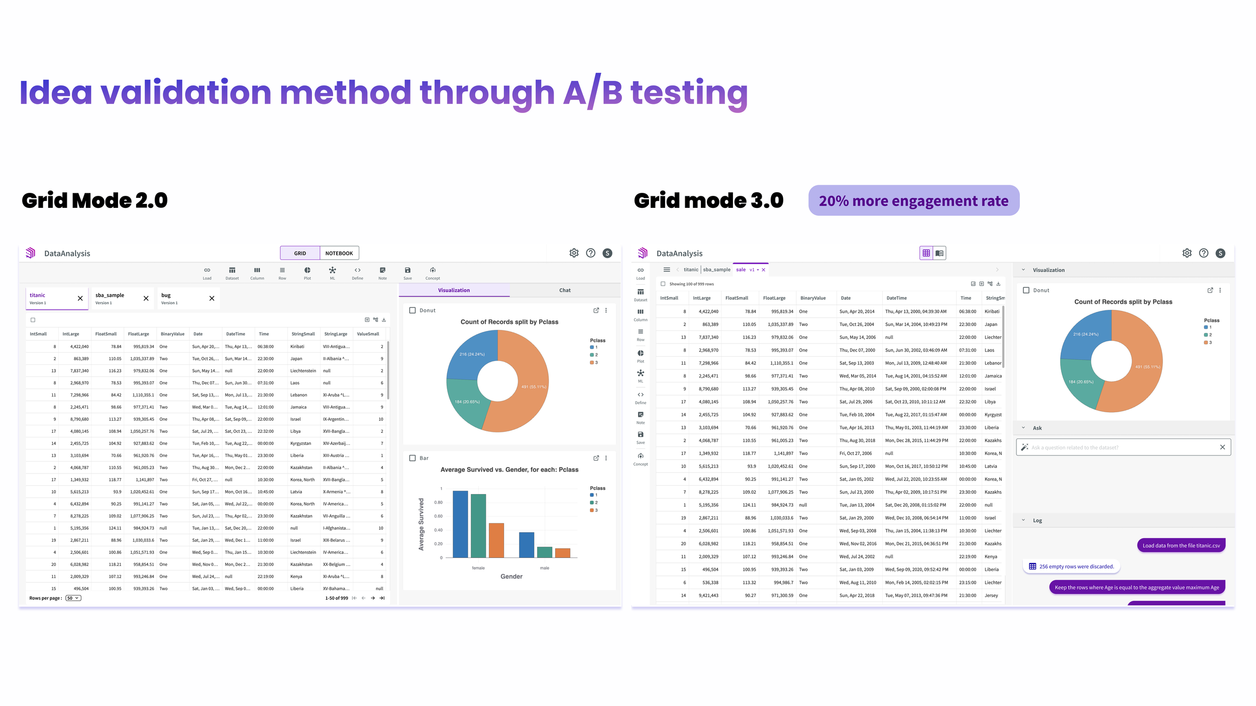
This is the principal design that has gone through numerous iterations and rounds of releases.
Replaced all washout blue with branding purple to enhance contrast in terms of accessibility
Added more user-friendly features to the dataset tabs: version list, close button, navigation
Moved the skill bar from top to side so that more vertical space can be wisely used to display data
Created more versatile data table with control on different granularities and infinite scrolling
Re-designed the right panel with scalable and flexible according panel
Unified the style of icons and fonts for consistency
Iteration 3: Clear distinction for null values
NULL values are essential in statistics because the percentage of NULL values can impact data cleaning requirements and the precision of data analysis results.
What I learned
A versatile table component is very important for data analysis platform
Don’t make any assumption before conducting user research
A user-centered design is iterative and detail oriented
Good design needs good communication across multi-functional teams, such as the customer success team, engineering team, and product directors
Consider accessibility at each point of design
Impact
🏆 Improved Conversion Rate by an outstanding 20% and reduced the Time on Task for users to analyze data.
🏆 The refined Grid mode has become The Most Popular Mode across the release milestones.
“😊 I feel much more confident using the spreadsheet mode to analyze my data, especially without coding experience.”
“😀 It’s much more enjoyable to play in Grid mode, and the null style is a delicate addition that helps visualize dataset statistics.”

